Hickory cabinets are having a moment. Their rich, varied grain patterns and warm undertones have made them a kitchen staple for homeowners who want character without the fussy upkeep of painted finishes. But here’s the thing: choosing the right color scheme for hickory cabinets can feel like walking through a paint aisle blindfolded. Too many warm tones and your kitchen becomes a brown box: go too cool and you’ll fight the cabinet’s natural warmth. The good news? Nailing a farmhouse color scheme for kitchens with hickory cabinets, or any aesthetic you’re after, comes down to understanding how color relationships work. We’ve put together seven proven palettes that work because they respect hickory’s strengths while adding visual interest and depth to your space.
Table of Contents
ToggleKey Takeaways
- Color schemes for kitchens with hickory cabinets succeed when wall colors complement or intentionally contrast with the wood’s natural warmth without competing for visual attention.
- Warm neutrals like cream, warm gray, and taupe are timeless and forgiving pairings that let hickory cabinets remain the focal point while keeping the space bright and inviting.
- Bold contrasts—navy blue, charcoal, and deep green—create personality and drama in hickory kitchens when applied strategically to accent walls or single features rather than entire rooms.
- Lighting conditions dramatically affect how colors read against hickory; always test paint samples in your actual kitchen at different times of day and under both natural and artificial light.
- Countertops, backsplash, and hardware must work in harmony with your wall color choice; lighter countertops, white subway tile, and hardware that matches your palette create visual hierarchy.
- The 60-30-10 design rule—60% dominant color (hickory), 30% secondary (backsplash or island), 10% accent colors (hardware)—ensures your kitchen feels cohesive and intentionally designed.
Understanding Hickory Cabinet Characteristics and Design Challenges
Before you pick a color, you need to know what you’re working with. Hickory is a tight-grained hardwood with natural color variation, think blonde, brown, and reddish tones all mingling in the same plank. This character is exactly why people love it, but it also means your wall colors need to play well with busy surfaces.
The challenge: hickory cabinets are not a blank canvas. They bring their own warm, sometimes rustic personality into the room. Paint a wall a cool gray and it might look dull next to the cabinet’s warmth. Go too saturated with a warm tone and you’ll create a claustrophobic, muddy effect. Wall color, backsplash, countertops, and even flooring all compete for attention when your cabinetry is already visually busy.
The real work isn’t picking one perfect color, it’s creating a hierarchy. Your hickory cabinets should remain the star, which means supporting colors need to either complement the warmth (warm neutrals, soft creams) or create intentional contrast (deep charcoals, navy, forest green) without screaming for attention. Mountain Home Kitchens: Discover often use this same principle with rustic wood elements, letting the wood shine while supporting walls stay neutral.
Lighting matters too. Hickory under warm incandescent light reads differently than under cool LED task lighting. If your kitchen gets natural north-facing light, colors will appear cooler: south or west-facing windows will warm everything up. Grab paint samples and live with them for a few days in your actual space, at different times of day.
Warm Neutrals: Timeless Pairings for Hickory Kitchens
Warm neutrals are the safest, most forgiving route, and for good reason. They amplify hickory’s natural beauty instead of fighting it.
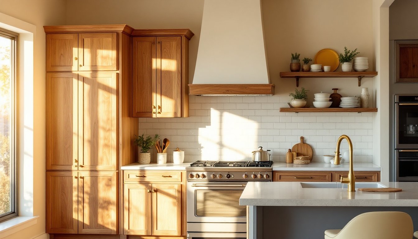
Cream and Soft White Wall Colors
Cream is the unsung hero of hickory kitchens. Not stark white (which can feel sterile against warm wood), but soft, warm cream with yellow or beige undertones. Think Benjamin Moore’s Cloud White or Sherwin-Williams’ Alabaster as starting points, these aren’t true whites, they’re creams with warmth.
Why it works: cream acts as a neutral backdrop that lets hickory be the focal point while keeping the space bright and airy. It also bridges the gap between your cabinetry and ceiling or upper walls. If you want the farmhouse color scheme for kitchens with hickory cabinets to feel cozy but not dated, a cream wall with hickory is nearly foolproof.
Pairing tips: cream walls + hickory cabinets + white or cream trim creates a cohesive, classic look. Add a butcher block or light wood countertop and you’ve got a warm, inviting kitchen. The white subway tile backsplash keeps things clean and reads as timeless rather than trendy.
Warm Gray and Taupe Options
Warm grays (sometimes called greige, gray + beige) are having a longer moment than cool grays for this exact reason. They don’t clash with hickory the way cool, blue-undertoned grays do.
Reach for Sherwin-Williams Agreeable Gray, Benjamin Moore Revere Pewter, or Behr Balanced Beige if you want a gray that leans warm. The undertone matters more than the label. When you’re comparing samples, hold them next to your hickory samples in your kitchen’s actual light. A gray that looks perfect in the paint store might read too cool once it’s on the wall.
Taupe brings even more warmth. It’s basically a grayed-out brown, so it harmonizes with hickory without repeating it. A taupe wall can feel sophisticated and slightly more interesting than cream, especially if you introduce contrast through hardware, countertops, or backsplash. Pair warm gray or taupe with stainless steel hardware and a white subway tile backsplash for a look that’s clean but not cold. Resources like The Kitchn frequently feature warm neutral kitchens that prove this palette’s staying power.
Bold Color Contrasts That Complement Hickory Wood
If neutral walls feel too safe, bold contrasts create drama and personality. The key is intentional contrast, not random color pairing.
Navy Blue and Charcoal Accents
Navy blue is the dark, sophisticated sibling of cream and warm gray. It works with hickory because it doesn’t try to match, it establishes a visual hierarchy. Navy walls make hickory cabinetry pop, especially in kitchens with lots of natural light.
Application: Paint just one wall (often the wall behind your sink or the dominant wall you see when entering) in a rich navy like Benjamin Moore Hale Navy or Sherwin-Williams Naval. Keep adjacent walls neutral or white to prevent the room from feeling like a cave. Pair navy walls with stainless steel appliances, white subway tile, and brushed nickel or brass hardware for a modern farmhouse feel.
Charcoal is navy’s grittier cousin, darker, slightly less formal. A charcoal accent wall can work, though it risks absorbing light in smaller kitchens. Where charcoal really shines is as trim, a feature wall, or even a single cabinet face mixed into an otherwise hickory cabinetry run. This approach is bolder and requires confidence, but it’s a way to introduce the farmhouse color scheme for kitchens with hickory cabinets without committing your entire kitchen to one dark tone.
Consider the 60-30-10 rule: 60% of your kitchen in a dominant color (hickory cabinets, warm walls), 30% in a secondary color (backsplash, island paint, or countertop), and 10% in accent colors (hardware, bar stools, tile detail).
Deep Greens and Earthy Tones
Deep greens, forest green, sage, hunter green, have quietly become the coolest neutral. They’re earthy enough to pair with hickory’s warmth but distinctive enough to feel intentional.
Why green works: it’s a bridge color. It shares warm undertones with hickory but leans cooler, creating subtle contrast without jarring your eye. A deep forest green wall behind open shelving or in a pantry feels both natural and sophisticated.
Shades to test: Benjamin Moore Hunter Green, Farrow & Ball’s Calke Green, or Sherwin-Williams Evergreen Fog (yes, that’s a real color name, and it’s stunning with warm wood). Again, samples in your actual space under your actual lighting are non-negotiable.
Pairing strategy: forest green walls + hickory cabinets + warm brass or bronze hardware + white or cream countertops create a kitchen that feels rooted and intentional. If you’re not ready to commit an entire wall to green, try it on a pantry door, inside open shelving, or a single cabinet face. Homify showcases many examples of green kitchens paired with warm wood, and you’ll see the palette works at every scale.
Earthy tones like terracotta or warm ochre can also work if your lighting is warm and your hickory leans toward the reddish side. These are less safe bets for most kitchens but can be stunning in the right space. Test aggressively before committing.
<h2 id="” data-id=””>Tying It All Together: Countertops, Backsplash, and Hardware
Your wall color is just one piece of the puzzle. Countertops and backsplash are equally important to the overall scheme.
Countertops that work: white or cream quartz (clean, modern), butcher block or light wood (warm, farmhouse), or light gray/taupe stone (neutral, grounding). Dark countertops can overwhelm hickory cabinets: aim for lighter to mid-tone surfaces that let the wood remain the focal point.
Backsplash: white subway tile is the reliable choice and rarely fails. If you want more personality, try a light gray, cream, or even a subtle geometric tile pattern in warm tones. Avoid dark or heavily patterned backsplashes if your walls are already bold, too much contrast becomes chaotic.
Hardware and fixtures matter: brushed nickel or stainless steel feels modern: brushed brass or bronze feels warm and farmhouse. Match your hardware tone to your overall palette. If you’ve chosen warm neutrals, brass or bronze will feel cohesive. With navy or charcoal walls, stainless steel or polished nickel maintains crisp contrast.
Lighting ties everything together. Warm white LED bulbs (2700K color temperature) will enhance cream, taupe, and warm gray walls while keeping hickory’s warmth intact. Cool white light (4000K+) can make those same walls feel flat or institutional. Houzz is packed with before-and-afters that show how lighting choices affect color perception, worth a browse if you’re serious about the final look.